Subscription Tracker in Discover
What is the Problem?
As subscription-service models increase in number, consumers have a
difficult time keeping track of them. Unless people manually keep track
of their subscriptions, there is not often a place where someone can view
all their subscriptions. Some people can stop using a service, but because
they are still subscribed to the service, they would continue paying for
something they are not even using! Their money would be taken without them
being aware of it.
User Research
Secondary Research Findings
- Subscription for a subscription? Subscription managing
apps/tools exist, but unfortunately, they require additional monthly payments to use.
An example of this would be Rocket Money, which is efficient in design,
but backwards in execution.
- Limited Access.
A majority of banking apps have a feature that manages subscriptions, however
it is hard to find or access and are not specified towards subscriptions. It
also lacks many functions that many would consider to be necessary.
Conducting Surveys
Starting our primary research, we distributed our surveys. The surveys also acted
as a screener for those who were willing to accept an interview and for us to
find a diverse range of participants.
Survey Questions:
- What is your age? (mult. choice)
- What is your gender? (mult. choice)
- What is your occupation? (mult. choice)
- Around how many subscription services do you use? (Ex. Netflix, Amazon Prime, gym membership, food delivery, news, etc.)
(mult. choice)
- The ability to cancel or change subscriptions is important to me. (Likert scale)
- How do you currently manage your subscriptions?(mult. choice)
- Have you found yourself paying for a subscription you don't use anymore? (mult. choice)
- Are there any specific issues or challenges you have encountered when managing your
subscriptions in the past? (open-ended)
Interviews
Diverse User Group
We chose a wide range of interviewees in not only terms of demographics,
but also in types of subscriptions. We also made sure that the people we
interviewed had varying starting levels. This means that we picked people
who range from having no subscription management to people who use some system.
Pain Points
One of the goals was to understand where in the subscription tracking process
improvements can be made. It was another way for users to give more specific
pain points than in the survey in an emotional and open-ended manner, improving
our ability to empathize with others.
Research Insights
Survey Analysis
Approximately 70 people had answered the survey. We had an obvious skew in the results of the survey.
It made sense as we mostly distributed the survey to college-student aged people, so it is important
to keep this skew towards the younger adult survey-takers. The range of subscriptions mostly ranged
between 1 to 6 subscriptions.
We have learned that people think it's important to easily change a subscription. Unfortunately,
the majority of people did not currently manage their subscriptions. More than half even had paid
for a subscription they don't use! This solidified our problem statement further.
Interview Analysis
The majority of people we interviewed have an experienced a time where an unwanted subscription
has been charged to them. This has led to some frustration towards our users. It is often
difficult to cancel a subscription service, especially once when a user begins this service.
Some users, especially for older demographic users, commonly do not remember all the services
they are paying for.
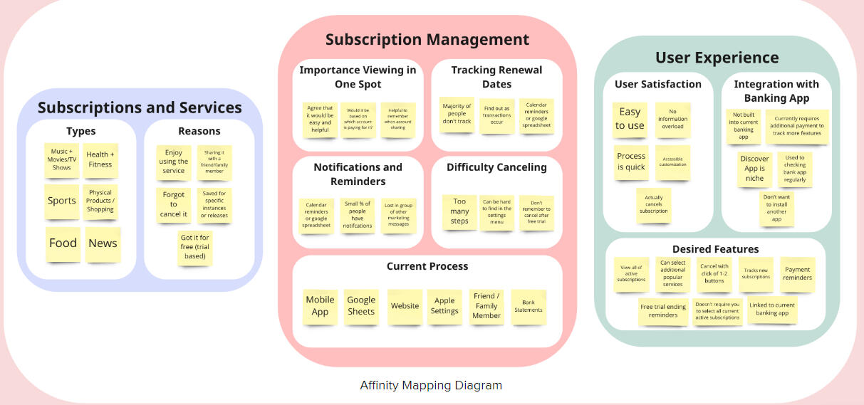
Organizing Insights
We used an affinity map to organize our insights into three categories.
We then came up with a how-might-we question and asked...
"How might we help our users track and manage their subscriptions easily?"
Design and Prototype
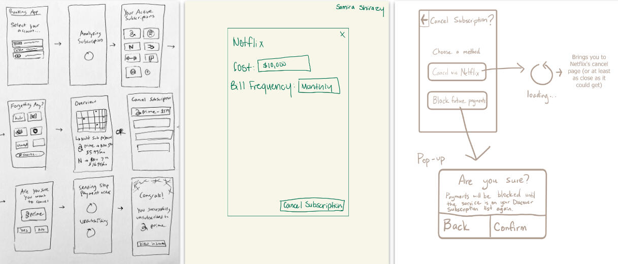
Sketches
We created sketches to simulate the flow of how users would navigate the application. Specifically,
we chose a flow where the user would cancel a subscription within the Discover application itself.
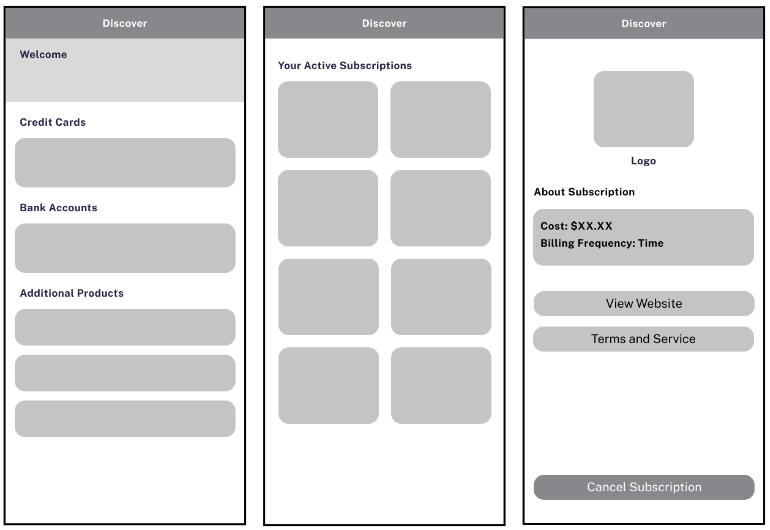
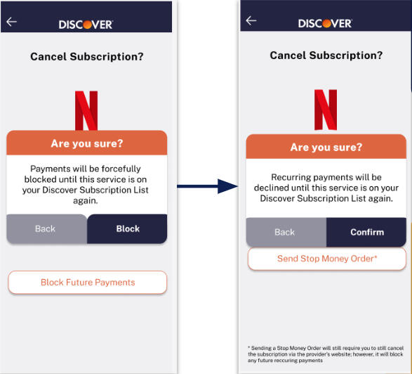
Prototyping
Below are two screenshots of the prototypes we had created.
Critiques and Improvements
When seeking feedback, we asked our peers to be critical against our designs. They had told us:
- Make the text more specific and less confusing
- Standardize spacing between buttons/cards for a more uniform look
- Use icons over text when appropriate
- Think about the app's usability outside of the banking app, including
the notification banner and the setup of the service
After the critique, the our team looked over our prototype with a purpose of improvement.
We improved our user flow and clarity while being intentional with text and allowed for
alternate explanations of the functions. We continued usability testing while questioning
if the text buttons make sense in accordance to size, spacing, and location. Below is an
image of an example of one of our changes we had made.
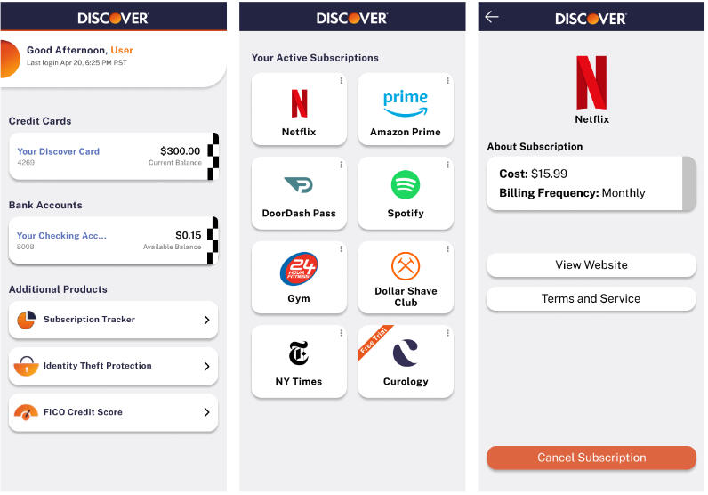
Prototype
Click To Try the Prototype
Reflection
One of the challenges was using a pre-existing interface/brand. At this point, nobody in the
team has tried to mimic a brand's pre-existing interface nor used their designs to base something new off of theirs.
Another challenge was trying to understand the perspective of the user. For example, even though the designers knew that
"blocking" was a word to describe the bank blocking the money from going to said-subscription service, the user would
not always know that.
The last challenge would be the logistics behind this service. We have not contacted Discover about
collaborating with us and this is a school project. However, due to the views that subscription services have, it
is possible that Discover would not work with us for this, even if it is in the interest of its users.